Burn Down
Chart

A simple story-based guide to understanding burn down charts in Agile project management.


Table of Contents
Share This Article
Often people find Burn Down Chart to be difficult. And, rightly so. So, let me simplify this concept for you, without any further delay, in my usual story style.
Imagine you and your friends have gone for a camping trip. You are having loads of fun.

With thanks to Kelsey Chance on Unsplash
The cold breeze of evening, reminded you – it's time to light up that fire. You notice that your friend Sara, frequently checks on the wood.

With thanks to Mark Renken on Unsplash
"I am just checking how much is remaining, so that I can refill it", comes a cheerful remark when she sees you smiling. Yes, my dear friends, when you check how much work is remaining, it is like plotting burn down chart.
Now, how to read a real burn down chart. An example Burn Down Chart would be:
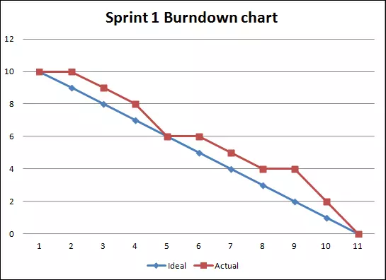
Understanding is very simple. In this example, X-Axis shows days – day 1, day 2 etc. Y-Axis indicates the story points in the backlog. How to read, let's see:
| Day # | Actual Pts Remaining | Ideal Pts to remain | Explanation |
|---|---|---|---|
| 1 | 10 | 10 | On first day of the sprint, points in Sprint Backlog are 10. These are the points; team has to burn or complete in the entire sprint. On the last day of the sprint no work should be remaining (0 story pts). Draw a straight line from 10 to 0, it gives you the ideal line or the planned line. |
| 2 | 10 | 9 | Blue line indicates, ideally how much points should remain for team to meet the sprint goal. So, 10 are remaining whereas 9 should have been. Hmmm, looks like team has some catching up to do. |
| 3 | 9 | 8 | Team should have now only 8 points remaining to be finished. They have 9, looks like they are still Behind Schedule |
| 5 | 6 | 6 | Aahaa, team now has exactly the amount of work remaining in the backlog what they should have. The team is On Time. |
Isn't it simple? Hahaha, we often get scared, when we see graph. They are actually very intuitive and fun to read, only if you know how to.
Hope you found this article interesting and useful. You can find more content on our blog, till next time happy learning!
Explore Our Latest
Insights

Stay updated with our recent blog posts.


